From the Sublime to the RidiculousRon Cook's Only Major League Cards
'71 Topps # 583 '72 Topps # 339
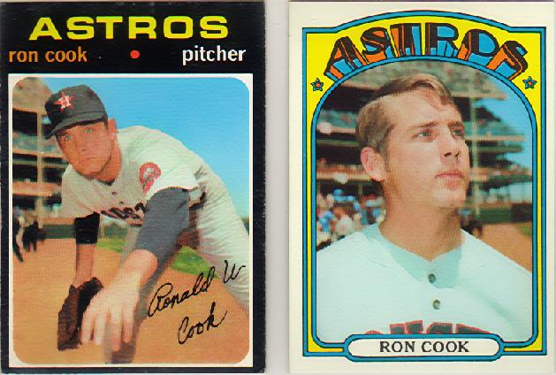
While it appears that Ron Cook pitched capably at AAA Oklahoma City for a couple years, then moved to the Astrodome and did the very same thing for a couple more, this particular pagelet is more concerned with the two major league cards he appeared on, the two Topps you see above.
'72 Topps # 339
While it appears that Ron Cook pitched capably at AAA Oklahoma City for a couple years, then moved to the Astrodome and did the very same thing for a couple more, this particular pagelet is more concerned with the two major league cards he appeared on, the two Topps you see above.
Despite its black, borderless design, which makes finding a good-looking specimen of each card a tough proposition, the '71 Topps set is considered a classic by those who think about such things. Minimalist, minimalist, minimalist. And clean.
On the other hand, those same people call the '72 edition, the "psychedelic set." Of course most baseball people don't know a lot about Kelly and Mouse, and don't realize that the '72 set is much inferior to your average Grateful Dead poster.
I mean, I'm a guy who like loud colors--that's one of the reasons I like the Astros and just look at the Astroland homepage--but the '72 issue to me seems like a paean to bad taste. Put another way, the '72 set is to cards what the '77 - '79 Charleston Charlies duds (here) are to uniforms. 'Course in a way that makes the set kind of cool.
. . .Art people call that postmodernism.
Anyway, that Topps could go from one year to the next in creating one of its most beautiful sets to one of its ugliest is one of baseball card collecting's little ironies.
Back to Astroland